When you get sidetracked but lean into it
Sometimes you get inspired by something and you end up putting your plans to the side for a significant mini detour
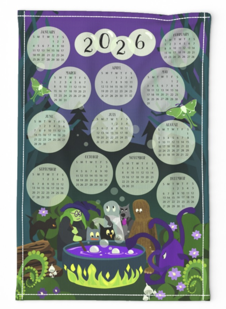
The instant I saw Spoonflower’s Tea Towel Calendar challenge, I was curious. When I saw examples from last year, I knew I had to participate. But I wanted to do something a related to my urban fantasy pen name, Lori Ravenford. I immediately had an image of a forest witch brewing something magical in a dark forest with her cryptid and folklore friends. Bubbles for the months of the year rising into the dark forest night like magical fireflies.
The first challenge
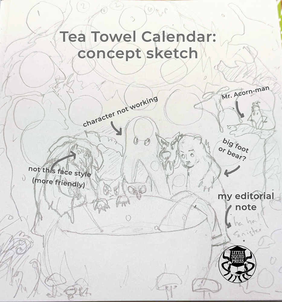
I could see the image in my head, but it took a while to get my rough sketch to look like how I wanted. After a lot of fiddling, I got something I liked enough to work with. While my original inspiration was something darker and more gothic in line with the Rivershade serial I’m writing (pen name Lori Ravenford), the creatures I sketched didn’t have angst. They were cute, and I loved them. I decided to lean into it. So off I went to make vector art in Adobe Illustrator.
Miffy on my mind
I’m not sure how other people use Adobe Illustrator, but for me, it feels like I get to lay patches of color, like I’m cutting out swaths of paper and making a collage.
I think my influence here might be Dick Bruna. On a trip to Amsterdam years ago, I went to a Dick Bruna exhibition and got to see how they made Miffy images, photographing those great blocks of solid color cutouts with black outline overlays. I love that simplicity of Bruna’s characters. While I don’t want to always emulate that, I feel like my work in Adobe illustrator really connects to that vibe because I tend to make large shapes.
Color palette challenges
Again, I got to excited and I jumped too soon. I started adding color before I really decided on my palette. I had an idea what I wanted, I just… lacked some initial discipline.
Playing with color is fun but working with color is magic. I had to backtrack and really nail down the palette that I wanted. One bonus of surging on ahead: I got to see what was not working. A quick consult with mentor, Claudia Orengo helped me snap the idea into place. And a more unified, deep jewel-toned forest night palette evolved.
Editing
This seems like a weird thing to talk about when making an image. But Brewing Up the Magic for 2026 has a strong narrative element to it and some characters weren’t pulling their weight. So editorial decisions had to be made. To fix or to toss? That was the question.
The forest witch
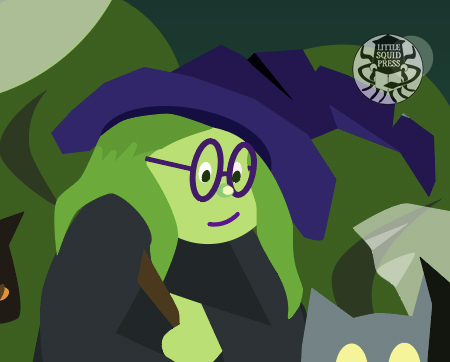
The forest witch was more challenging than expected. I had a vision for her that was a lot more haunting and creepy forest. But once I started drawing, she wasn’t scary. At all. Worse, she felt a bit bland. I decided she needed to be cuter. I originally gave her my nose, but it looked wonky. I settled for a button nose and a pair of glasses like my beloved older purple pair. RIP glasses. You served me well for over a decade.
Questionable nut characterization
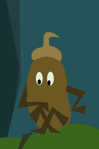
Mr. Acorn-Man… did not look like an acorn. At the correct scale, it looked like a creepy, speedy beetle (IYKYK).
It’s placement in the trees took away attention from the action around the cauldron.
Sorry Mr. Acorn-Man. Hopefully, I’ll find a way to recycle you.
Ghosts are tricky
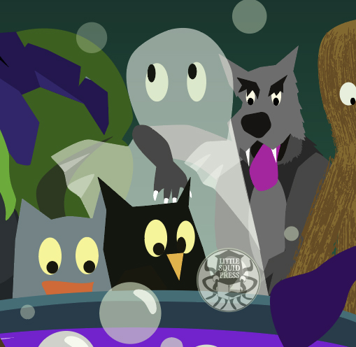
Originally, the ghost was supposed to be a cryptid called a walker. But it just looked like a giant blob and as an ensemble, it made the werewolf hard to read. I thought, “Hey, if only I could see through this a bit to show more of the wolf…”
Et voila! A ghost. But the opacity level was a challenge.
Favorite parts
Maybe I’m not supposed to have a favorite part of work. But with all the work I do, there’s always one bit that I love a little more than the rest—and it’s seldom the star of the piece.
Mini-background story favorite
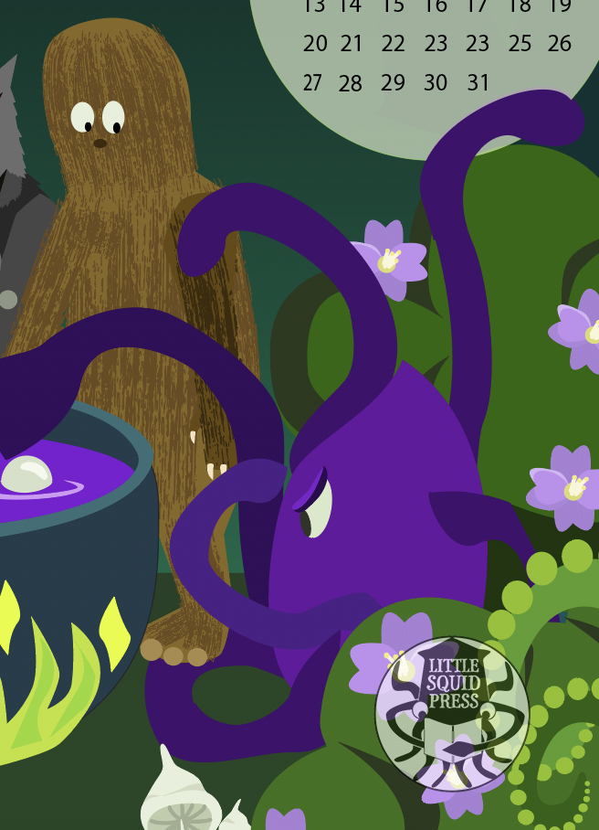
The interaction between Bigfoot and Land-Octopus was the most fun to draw and I got to channel some of my daily life into these characters. The Bigfoot’s uncertainty and clumsiness for stepping on a tentacle makes me laugh. And I feel there’s a lot of myself in Bigfoot. The octopus’s irritation and absolute-doneness with getting stepped on reminds me of how I feel riding the train at rush-hour. I promise I don’t have tentacles.
But beyond the characters themselves, this really reminds me of my favorite type of family/group photos. I love those photos where people aren’t focused on the camera, but some other interaction. It gives that real air of authentic lives lived.
The cat
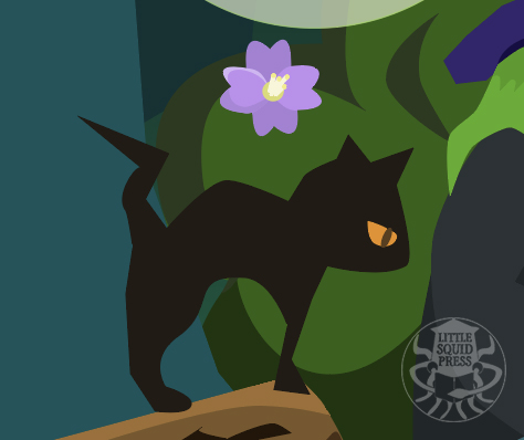
Love this cat. I feel like this cat is judging the whole process—as is proper for a cat. I’ve always wanted to live with a black cat. There’s a stray in the neighborhood taken care of by everyone and she looks like a little vampire kitty.
I’m actually working on some patterns with the cat and moth and I’m looking forward to a reveal of it soon.
The reveal
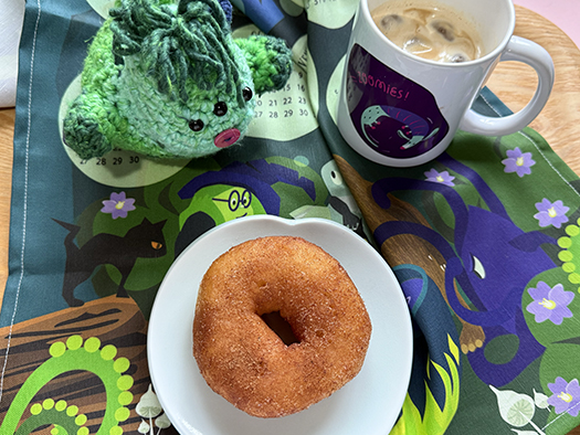
I waited to post this article until I received my order from Spoonflower so I could see how the colors and detail turned out. Honestly, when I pulled it out of the bag, I literally ooohed like I was watching fireworks. The colors were vivid, and some of the smaller details I worried about — like the mushrooms in the foreground — came out as well as I hoped.
And here’s the finished product as screenshot from the Spoonflower site, and in use in my atelier. (Donut courtesy of my husband).
What part of the design do you like best? I’d love to know.
Where it’s available
Tea towel or fabric: at Spoonflower (affiliate link)
Poster: at Zazzle (affiliate links)
Please consider using my affiliate links. It helps a lot with my career at no extra charge to you.
Stay inky my creative friends
I hope you enjoyed this short breakdown of the calendar. Next up are surface patterns based on this calendar.

If you liked this article
And curious about my behind-the-scenes write-ups, check out:
Designing the World of the Water Rabbit
Creating the Cardinal of Resistance Series
Author:
Lori/Little Squid Press is an independent publisher, writer and designer based in Tokyo, and the creator of Little Squid Press. Read the bio here.