How a Side Quest Became the Brewing Up the Magic Tea Towel

When you get sidetracked but lean into it

Sometimes you get inspired by something and you end up putting your plans to the side for a significant mini detour

The instant I saw Spoonflower’s Tea Towel Calendar challenge, I was curious. When I saw examples from last year, I knew I had to participate. But I wanted to do something a related to my urban fantasy pen name, Lori Ravenford. I immediately had an image of a forest witch brewing something magical in a dark forest with her cryptid and folklore friends. Bubbles for the months of the year rising into the dark forest night like magical fireflies.

The first challenge

I could see the image in my head, but it took a while to get my rough sketch to look like how I wanted. After a lot of fiddling, I got something I liked enough to work with. While my original inspiration was something darker and more gothic in line with the Rivershade serial I’m writing (pen name Lori Ravenford), the creatures I sketched didn’t have angst. They were cute, and I loved them. I decided to lean into it. So off I went to make vector art in Adobe Illustrator.
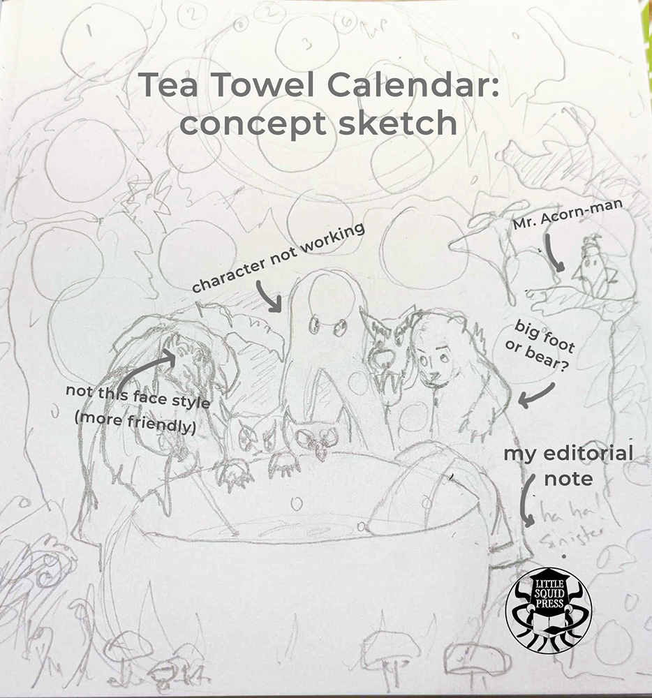
Annotated concept sketch for the Little Squid Press Tea Towel Calendar showing woodland characters gathered around a cauldron with handwritten editorial notes documenting the illustration development process. Sketch in pencil. Comments done in PS.
A cute concept that I liked but somehow it wasn’t the vibe I wanted yet.

Miffy on my mind

I’m not sure how other people use Adobe Illustrator, but for me, it feels like I get to lay patches of color, like I’m cutting out swaths of paper and making a collage.

I think my influence here might be Dick Bruna. On a trip to Amsterdam years ago, I went to a Dick Bruna exhibition and got to see how they made Miffy images, photographing those great blocks of solid color cutouts with black outline overlays. I love that simplicity of Bruna’s characters. While I don’t want to always emulate that, I feel like my work in Adobe illustrator really connects to that vibe because I tend to make large shapes.

Color palette challenges

Again, I got to excited and I jumped too soon. I started adding color before I really decided on my palette. I had an idea what I wanted, I just… lacked some initial discipline.

Playing with color is fun but working with color is magic. I had to backtrack and really nail down the palette that I wanted. One bonus of surging on ahead: I got to see what was not working. A quick consult with mentor, Claudia Orengo helped me snap the idea into place. And a more unified, deep jewel-toned forest night palette evolved.

Editing

This seems like a weird thing to talk about when making an image. But Brewing Up the Magic for 2026 has a strong narrative element to it and some characters weren’t pulling their weight. So editorial decisions had to be made. To fix or to toss? That was the question.

The forest witch

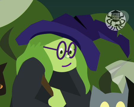
The forest witch was more challenging than expected. I had a vision for her that was a lot more haunting and creepy forest. But once I started drawing, she wasn’t scary. At all. Worse, she felt a bit bland. I decided she needed to be cuter. I originally gave her my nose, but it looked wonky. I settled for a button nose and a pair of glasses like my beloved older purple pair. RIP glasses. You served me well for over a decade.
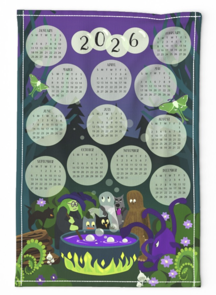
Brewing Up the Magic for 2026 is a vector design by Lori Ono of Little Squid Press. Image features forest witch and crytpid friends around a cauldron while bubble emerge from the brew and form months of the year.

Questionable nut characterization

Vector image of an acorn-inspired creature sitting on a green leaf blog with a dark blue background.

Mr. Acorn-Man… did not look like an acorn. At the correct scale, it looked like a creepy, speedy beetle (IYKYK).

It’s placement in the trees took away attention from the action around the cauldron.

Sorry Mr. Acorn-Man. Hopefully, I’ll find a way to recycle you.

Ghosts are tricky

Originally, the ghost was supposed to be a cryptid called a walker. But it just looked like a giant blob and as an ensemble, it made the werewolf hard to read. I thought, “Hey, if only I could see through this a bit to show more of the wolf…”

Et voila! A ghost. But the opacity level was a challenge.
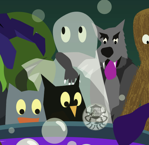
Excerpt of Brewing Up the Magic for 2026 focusing on the ghost in the crytpids and folklore creatures section. Next to the ghost is a wolf and on th other side are two owl-like creatures.

Favorite parts

Maybe I’m not supposed to have a favorite part of work. But with all the work I do, there’s always one bit that I love a little more than the rest—and it’s seldom the star of the piece.

Mini-background story favorite
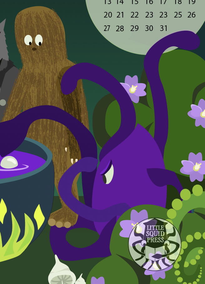
Brewing Up the Magic for 2026 is a vector design by Lori Ono of Little Squid Press. Image features forest witch and crytpid friends around a cauldron while bubble emerge from the brew and form months of the year.

The interaction between Bigfoot and Land-Octopus was the most fun to draw and I got to channel some of my daily life into these characters. The Bigfoot’s uncertainty and clumsiness for stepping on a tentacle makes me laugh. And I feel there’s a lot of myself in Bigfoot. The octopus’s irritation and absolute-doneness with getting stepped on reminds me of how I feel riding the train at rush-hour. I promise I don’t have tentacles.

But beyond the characters themselves, this really reminds me of my favorite type of family/group photos. I love those photos where people aren’t focused on the camera, but some other interaction. It gives that real air of authentic lives lived.

The cat
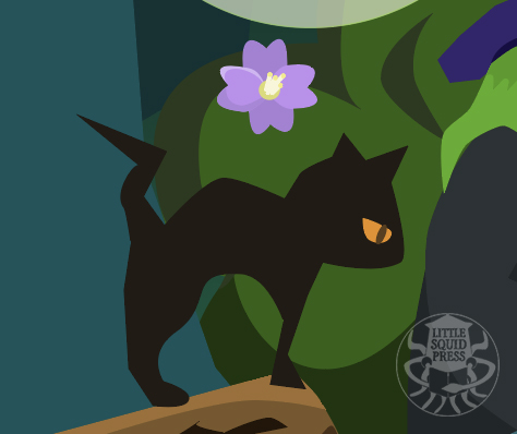
Brewing Up the Magic for 2026 is a vector design by Lori Ono of Little Squid Press. Image features forest witch and crytpid friends around a cauldron while bubble emerge from the brew and form months of the year.

Love this cat. I feel like this cat is judging the whole process—as is proper for a cat. I’ve always wanted to live with a black cat. There’s a stray in the neighborhood taken care of by everyone and she looks like a little vampire kitty.

I’m actually working on some patterns with the cat and moth and I’m looking forward to a reveal of it soon.

The reveal

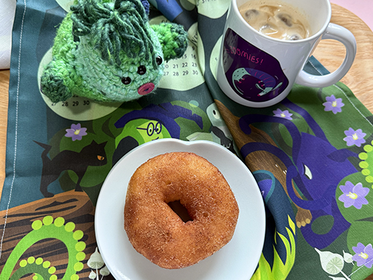
I waited to post this article until I received my order from Spoonflower so I could see how the colors and detail turned out. Honestly, when I pulled it out of the bag, I literally ooohed like I was watching fireworks. The colors were vivid, and some of the smaller details I worried about — like the mushrooms in the foreground — came out as well as I hoped.

And here’s the finished product as screenshot from the Spoonflower site, and in use in my atelier. (Donut courtesy of my husband).
What part of the design do you like best? I’d love to know.

Where it’s available

Tea towel or fabric: at Spoonflower (affiliate link)

Poster: at Zazzle (affiliate links)

Please consider using my affiliate links. It helps a lot with my career at no extra charge to you.

Stay inky my creative friends

I hope you enjoyed this short breakdown of the calendar. Next up are surface patterns based on this calendar.

Black and white image. Little Squid Press logo (squid holding a book within a circle) flanked on both sides by a squid holding a coffee cup and sitting on a book.

If you liked this article

And curious about my behind-the-scenes write-ups, check out:

Designing the World of the Water Rabbit
Creating the Cardinal of Resistance Series

Author:
Lori/Little Squid Press is an independent publisher, writer and designer based in Tokyo, and the creator of Little Squid Press. Read the bio here.

Creating the Cardinal of Resistance Series

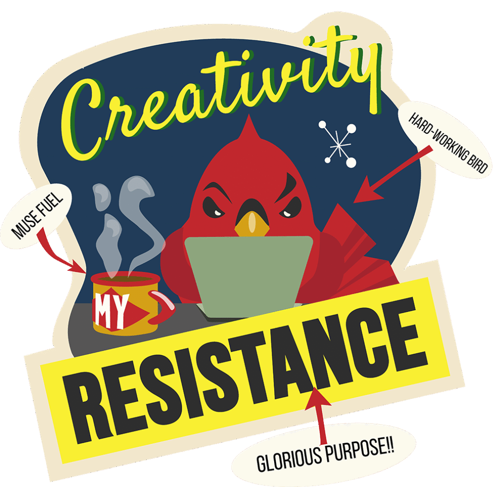
Compact sticker version of "Creativity is My Resistance" from the Cardinal of Resistance series. A red cardinal is working on a sage laptop with a cup of coffee sitting nearby. The background is navy blue. Text on the sticker: top "Creativity" (in script font, electric yellow with green drop shadow) Middle: "is" (letters formed by the coffee steam); "My" (on the cup) Bottom: "RESISTANCE" (bold black letters on a rectangle of the same yellow as the letters above. Text added to stickers describes tropes of sticker with red arrows pointing towards parts it describes. Towards the bird: "hard-working bird". Towards the coffee cup: "Muse fuel". Towards resistance: "glorious purpose"

The essence of the Cardinal of Resistance

The Cardinal of Resistance shows a cardinal using acts of creativity as quiet defiance in a world that tries to suppress it—even as it needs it most.

Before we go further: This post contains affiliate links. If you make a purchase, I may earn a small commission—at no extra cost to you. Thanks for supporting my creative work!

When the world feels like a dumpster fire…

Some days the news reads like a bleak dystopian novel and the planet looks like it’s stuck on “dumpster‑fire” mode. In those moments, breaking out the sketchbook or opening a blank document can feel, well… frivolous. But here’s the thing: choosing to create anyway is a quiet, stubborn act of resistance. Art doesn’t erase the problems—it keeps them from erasing you. Creativity recharges the soul so you can come back to the fight with fresh batteries and a sharper sword (or pen, or glue gun).

Someday I’ll post a cartoon of the Cardinal of Resistance riding the dumpster fire, but I gotta get the blog post out before I get buried in time-consuming possibilities.

Enter the Cardinal

The Cardinal of Resistance wasn’t born in some grand strategy meeting. It hatched out of:

  • Draw‑a‑Bird Day (April 8): I tried to channel Charley Harper’s mid‑century “minimalist realism” style and sketched a cardinal. Spoiler: my first attempt flopped (proof below—enjoy the comic relief!).
  • A friend in a funk: One afternoon my friend and proofreader extraordinaire, Sharon Muha, confessed she felt guilty making art while “real” issues raged on. I wanted to cheer her up, so I promised a mini poster just for her.
  • A curious coincidence: Cardinals don’t live where I grew up (Alberta) so Cardinals seem so cheery, bright and a little exotic. That same friend’s state bird happens to be a cardinal. Clearly the universe was nudging. Synchronicity!
Rough pen and ink cartoon o of three birds. The bird in the foreground is excited about a worm. The two birds in the background are gossiping about the first bird. In a purple circle with lime green text: Work place drama. Which bird type are you?
Cross-posted from my Lori Ravenford Instagram account for Draw A Bird Day. It was supposed to be an homage to Charley Harper birds but I veered off into comic-land.

Why a cardinal, not a raven? (much as I love corvids)

Given I write paranormal romance under the name Lori Ravenford, the opportunity to cross-pollinate was tempting. But the vibe didn’t fit. Ravens and crows scream “rebel,” but it also screams obvious. A cardinal, though? Bright, splashy, impossible to ignore—yet usually singing its own tune from the sidelines. That felt perfect: resistance that’s bold but not belligerent. Plus, “cardinal rules” was too delightful a pun to pass up.

 “Is it a canary in a coal mine?”

Someone asked if I meant the cardinal to be a canary‑in‑the‑coal‑mine metaphor. Honestly, I hadn’t planned it—but it fits. When our creative energy dries up, it’s a warning signal for society, too. If the makers stop making, something’s off in the collective air.

Mid‑century vibes & minimalist realism

I’m obsessed with retro palettes, abstract shapes, and Charley Harper’s knack for stripping forms down to their joyful essence. He called this Minimalist Realism. I love that concept—though I suspect my version leans more toward minimalist comic with a secretly maximalist heart. My work has more of a cartoon style than Harper’s, but the Cardinal of Resistance borrows that vibe: clean lines, bold color blocks, and a wink of vintage optimism.

Little Squid Press presents The Cardinal of Resistance Series. These 5 illustrated posters feature a character named the Cardinal of Resistance. In each poster, a red bird (cardinal) is engaging in a type of creative resistance: Creativity, Handmade, Reading, Resting, Writing. The color palette and design has a retro mid-century modern vibe.
Cardinal of Resistance Poster series available at Zazzle shop.

Does it work?

Creativity Is My Resistance hangs on the wall of my office. I notice that I often look at it when my brain feels tired, or I’m overwhelmed. It makes me smile and encourages me to keep going. One of my friends purchased the set and tells me they experience the same effect. Super happy it’s helping others! But does it work? I think if you want it to, it will.

Where the series is headed

Compact sticker versions!

The next step is to make compact stickers versions for the other four posters. Stripping back the palettes and elements. I’ve completed the set for Creativity. I’m excited to take on Writing is My Resistance, though Resting is My Resistance resonates right now.

Compact sticker version of "Creativity is My Resistance" from the Cardinal of Resistance series. A red cardinal is working on a sage laptop with a cup of coffee sitting nearby. The background is navy blue. Text on the sticker: top "Creativity" (in script font, electric yellow with green drop shadow) Middle: "is" (letters formed by the coffee steam); "My" (on the cup) Bottom: "RESISTANCE" (bold black letters on a rectangle of the same yellow as the letters above. Text added to stickers describes tropes of sticker with red arrows pointing towards parts it describes. Towards the bird: "hard-working bird". Towards the coffee cup: "Muse fuel". Towards resistance: "glorious purpose"

More posters?

I’m toying with the idea of making more in the series. One idea is about gardening inspired by Grant Wood’s painting American Gothic. A Rosie the Riveter “We Can Do It!” pose might be fun.

Sequential Art?

My storyteller brain is keen to create some sequential art stories for the Cardinal. What’s the backstory? I don’t really see a web comic but maybe some cards?

What resonates for you?

Which of the designs resonates with you the most? Is it the message or the color palette that calls to you? Leave a comment below and let me know. I’d love to hear your ideas!

Heed the Cardinal of Resistance

Next time the world feels too heavy, remember the Cardinal: perch somewhere cozy and create something. Whatever you do, create. You, and the world, need your resistance. It matters because it keeps hope loud and colors bright.

Want Your Own Cardinal of Resistance?

You can grab a print (or sticker!) in my Zazzle shop (affiliate link). Or sign up for my newsletter—subscribers get a free printable PDF of the compact Creativity Is My Resistance sticker.

Happy creating!

Lori/Little Squid Press

Little Squid Press imprint logo is a circular black and white image. A stylized squid reads a white book it's holding. The words Little Squid Press are written in white on the body.

Author:
Lori/Little Squid Press is an independent publisher, writer and designer based in Tokyo, and the creator of Little Squid Press. Read the bio here.

Designing the World of the Water Rabbit

9 pattern swatch of the Water Rabbit collection by Little Squid Press. Top row from left: 1. Water Rabbit and Message in a Bottle (Hero) . 2. Water Rabbit Hexagram 3: Plaid. 4.Seaweed an bubb;es. 5. Bubble Stream. 6. Wave Thread And Seed Pattern 7. Seamless net 8. Simple 3 color Stripe 9. triangle hexagram (all patterns in shades of navy, aqua and luminous green)

Designing the World of the Water Rabbit

The Water Rabbit is my very first Spoonflower collection. I’d been interested in surface pattern and textile design for a while, and I finally decided to do something about it. So I enrolled in a pattern design class with Claudia Orengo.

The Start

Sketch versions of the Water Rabbit, seaweed and message in a bottle. The Water Rabbit done in procreate (rabbit type of mermaid) is in shades of aqua has a shaded look. Seaweed and bottle in shades of aqua is in vector style.
Procreate sketch of the Water Rabbit on same image as vector drawn elements.


I began with a drawing I’d made in Procreate for my New Year’s card — a mermaid inspired rabbit. This became the base for creating a repeating pattern in Adobe Illustrator, following Claudia’s tutorial. Once I created other vector elements, I realized I needed to make a vector version of the Water Rabbit to keep the style consistent.

Claudia taught that a good pattern collection usually has about 10 designs centered around a “hero pattern,” and that there should be a story tying it all together. I think she meant a color or visual story—but naturally, my storytelling brain took over.

The Water Rabbit Concept

Once I had the rabbit, I started wondering: What kinds of things might this creature interact with? What kind of world does it live in?

Who is the Water Rabbit?
Where does it live?
Does it have friends?

Answering these questions became the backstory that unfolded:

The Water Rabbit lives in the deep, cold sea and feeds on magical seaweed. Sometimes it shops in the shallows and plays with jellyfish and cephalopod friends.

If you know me, you know what happened next: I went down the research rabbit hole (or maybe… research rabbit whirlpool?). 🌀

Rabbit Whirlpool 🌀 Research

Sketchbook research page: text surrounded by watercolor ink in shades of blue-purple and aqua. TOP TEXT: Water Rabbit concept story: the water rabbit lives in the deep cold water and eats magical seaweed or sometimes go shopping in shallower water for seaweed. It plays with its jellyfish and cephalopod friends. Left bottom text covers the types of depth zones in the ocean] epiplagic, mesopelagic, bathyplegic, abyssopleagic, hadopelagic. Nenthic zone refers to deep sea floor. Who are my cephalopod friends? Piglet squid 100-200m? Bobtail squid up to 920m? Angler fish 10-100m? Clione, Vampire squid 600-900m Flapjack squid 200-1000m Right bottom text: Euphotic (sunlight zone), Dysphotic (twilight zone), Aphotic (1000-4000m.sunlight doesn't penetrate. Photosynthesis not possible.) Suleight can't go to 1000 m. Seaweed doesn't grow in very deep water. About 100 m would be extreme limit. Kelp 5-15 m.

I dug into deep ocean habitats—what they look like, what kinds of creatures live there, and how color changes with depth. I didn’t end up including the jellyfish and cephalopod friends in the final patterns, but I love this world and plan to expand it. Maybe with cards or some sequential art?

Watercolor swatching on white paper using aqua and viridian mixes.

🎨 Research Benefits: Color

I did a lot of watercolor swatching—partly because it’s relaxing, and partly to explore color ideas. The Water Rabbit story called for cold blues that hinted at deep water layers, and colors that looked like glowing objects in the deep.

I even tried doing some full watercolor sketches. Ambitious? Definitely. Relaxing? Not really. But I think they’re kind of fun and they helped me make better choices for my palette.

water color and colored pencil sketches of the water rabbit in different poses. The water rabbit has body of a rabbit and tail of a fish. Like a rabbit mermaid.
Colored pencil, water color sketches of the Water Rabbit

🧵 Research Benefits: Pattern (and some deeeeeep dives)

Another challenge: What other patterns would fill out the collection?

Because I’ve lived in Tokyo for decades, I drew inspiration from traditional Japanese textile patterns. I was particularly drawn to tachikwaki (rising steam) and kikkō (tortoise shell hexagons),

Rought pencil and ink draft of Japanese pattern study. On the left: Tachiwaki (rising steam). Right: Kuginuki (nail). With ideas of squids or water rabbit in in the pattern.
Left: Tachiwaki pattern study. Right: Kuginuki pattern study
  • Tachiwaki (rising steam) in an underwater context reminded me of ocean currents. At first this reminded me of the East Australian Current from Finding Nemo. So of course I had to research if Japan had any major ocean currents and discovered the Kuroshio Current (Black Tide/Japan Current) and the Oyashio Current (Parent Current).
  • Kikkō is a tortoise shell hexagons pattern (not shown in this sketch). It felt structured and organic at the same time. And I loved the idea of a peek-a-boo pattern that the Water Rabbit could be caught swimming through. You can see it below.
  • The biggest surprise? The hardest pattern to get right was the simplest—stripes!
Aqua color way of my variation of the Tachiwaki (rising steam) pattern. Streams filled with bubbles of different sizes and cameos of the water rabbit in different bubbles.
Stream Bubbles. Part of the Water Rabbit pattern collection. Inspired by Tachiwaki pattern and ocean currents.
9 pattern swatch of the Water Rabbit collection by Little Squid Press. Top row from left: 1. Water Rabbit and Message in a Bottle (Hero) . 2. Water Rabbit Hexagram 3: Plaid. 4.Seaweed and bubbles. 5. Bubble Stream. 6. Wave Thread And Seed Pattern 7. Seamless net 8. Simple 3 color Stripe 9. triangle hexagram (all patterns in shades of navy, aqua and luminous green)
Water Rabbit collection

The Finished Product

A black dog with white paws and chest markings that looks like a shiba inu mix sits on a bed with a Water Rabbit pattern for the duvet cover.
Amelia gives her seal of approval.

I ordered my own duvet cover and pillowcase in the Water Rabbit design. I was a little nervous about how they’d turn out, but they came out exactly how I imagined! Now that I know about the quality, I’m looking forward to ordering more sheets or even a fleece blanket. I need more pillows and throws to complete the look.

And Amelia (my dog) loved them too—so much she chewed a tiny hole in one. 😅That means she likes it, right?

I think she was jealous because I was so excited about the duvet cover.

Want to Try Pattern Design?

If you’re curious about designing your own textiles or creating surface patterns, I highly recommend Claudia Orengo’s classes and her Design Path membership. She’s generous with feedback, encouraging, and makes the process fun and approachable.

The Future of the Water Rabbit

There are still a few more patterns I’m experimenting with for this collection, but this feels like a solid core. Claudia recommended some colorway variations. I like that idea but also feel like that changes the story a lot. Purple colors could be so fun though they don’t remind me of the deep ocean. Maybe Water Rabbit takes a vacation?

Beyond these patterns, I’d like to expand the world of the Water Rabbit world by creating some sequential art or cartoons of it playing with cephalopod friends. Stay tuned!

Little Squid Press imprint logo is a circular black and white image. A stylized squid reads a white book it's holding. The words Little Squid Press are written in white on the body.

Author:
Lori/Little Squid Press is an independent publisher, writer and designer based in Tokyo, and the creator of Little Squid Press. Read the bio here.